
CS:GO Finally Gets Much-Anticipated Panorama UI Update, and It’s Beautiful
CS:GO has essentially looked the same for the past 6 years. Contrary to some of the views expressed in forums, I would not say the game is dying. I do not feel this update was created, nor needed to be created, with the goal of saving the game. The gameplay is still classic, consistent, and enjoyable. However, requests for a better UI have been pouring in since 2012, and in December 2017, Valve pledged to release the more contemporary panorama UI. Today, that new UI is in beta, and I have to say, it is looking pretty darn good!
Dota 2 upgraded to a panorama interface in June 2015 with their “Reborn” update, giving many CS:GO players a glimpse of a modern UI and how it can impact the feel of a game. Going through all the menus and gameplay in the beta, it seems like everything has received the “panorama treatment.” This UI update completely modernizes CS:GO and changes the look entirely.
It feels so much more polished and much more responsive as well. This update is also more modular by nature and should allow for much easier future development. Some of the great suggestions I have heard include a FACEIT integration and an open system where apps can be added or removed from the home screen. Is this what 2018 is supposed to look like? I think I like it.
Hopefully, this will permanently leave the clunky flash-based UI in the past. And right off the bat, I can confirm this is not just a visual facelift. Everything is smoother; it now transitions seamlessly between the game and the UI, there is no more stutter when you hit escape to access the menu (which now finds itself off to the left during gameplay, out of your field of vision), there is no more time delay when moving backwards in demos, there are tons of new, smooth animations, and more.
Along with the polished gameplay and transitions are a plethora of newer features: in-game, there is a new timer, kill feed, map, and scoreboard. Also, you can now see your teammates’ equipment in the buy menu (a long-requested feature). The new in-game scoreboard displays more stats that update at the end of every round. One of the best of these is your ADR (average damage per round). Also, the social menu can still be accessed in-game by mousing over the right side of your screen.
Now, it is still a beta, and as such, there are plenty of kinks to iron out. Aside from the usual FPS/latency issues and occasional freezing common with updates still in beta, there are some design flaws that players would like to see addressed. The new in-game scoreboard is too opaque, which partly blocks your vision when you tab. In the old UI, the scoreboard was only just slightly darker than the background, allowing you to still see incoming enemies and your own crosshairs.
Unfortunately, this isn’t a bug, so it is likely not going to be fixed before the release. The new map lines are jagged and blurry when you rotate, and the map itself is quite dark and hard to read. At the map selection screen, the white outline around highlighted maps is hard to distinguish; green would be preferable.
Now, all of these really are nitpicking. It’s a beautiful interface that flows nicely, especially for a brand-new beta. If you agree with these criticisms or maybe have some more of your own, be sure to submit tickets to the developers so that we can get them taken care of. That is, after all, why they give players access to betas before the actual release.
But don’t take my word for it. Here’s how you can check out the new panorama UI for yourself (You will have to download a 468mb update.)
- Open Steam
- CS:GO
- Properties
- Beta
- Panorama UI Preview (Steam will restart)
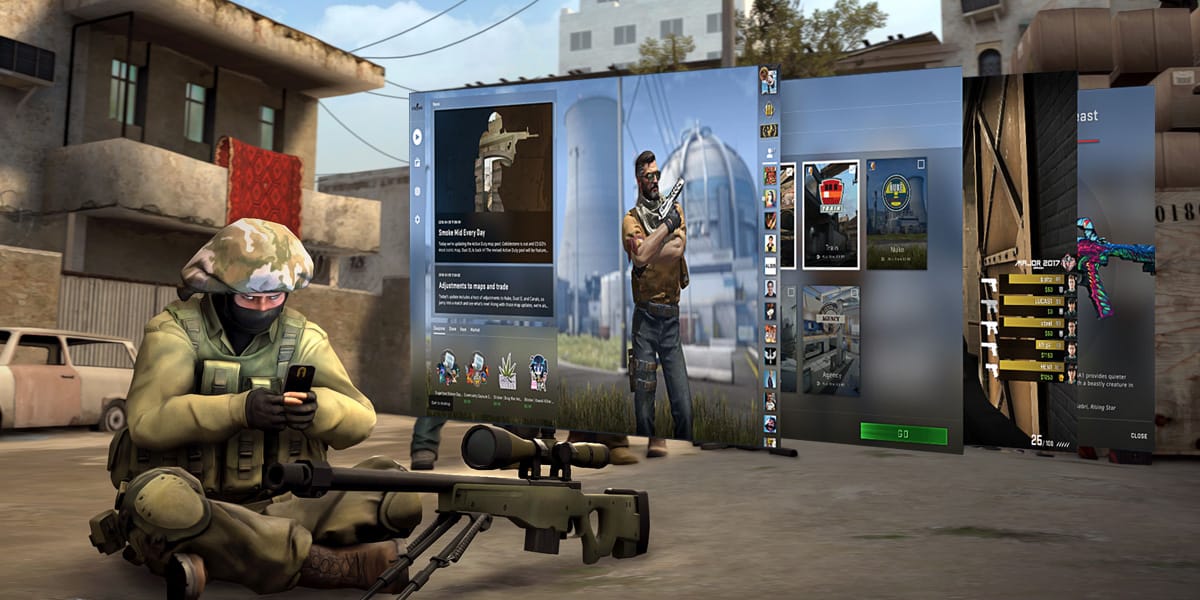
Upon opening, you will be greeted by either a terrorist or counter-terrorist, and lookie there, he’s wearing one of your actual skins. On your left, you’ll see the CS:GO News Feed and the shop (coupons, store, keys, and market). If you mouse over to the right, another menu will appear, and you can view your profile, ranks (including your wingman rank), badges, and friends list. You can now inspect and try out items from cases before you open them, which includes some pretty seamless interaction of these 3D assets. Unlocking cases also has some pretty sweet new animations. I even found a use for the animated player model in the middle of the home screen; when viewing a 3D weapon model, you can select to see it on a specific character model and then select that model to be the one displayed on the home screen. It’s not really enough to justify the toon taking up so much real estate, but it’s a nifty new feature nonetheless.
Hey Great Blog!